Thursday, 6 June 2013

Sweet Indigo Dreams


Bowl by ceramist Michelle Michael of Elephant Cermics
Photo: Elephant Ceramics
 

I have recently turned my dabbling instincts toward my bedroom. When I reflect on the state of my present bedroom and bedrooms past, I realise that they have represented the wild west of my home. My bedroom is typically a dumping ground for unfolded laundry, kids things and anything I do not want visitors to see. Well, that is all about to change as I set out to tame this final frontier. I am determined to reform my slovenly, neglectful ways and make my bedroom a place to enjoy.


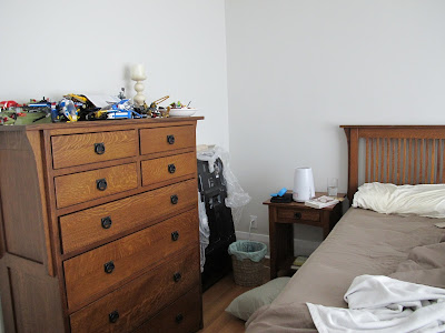
THE BEFORE


Pretty bad, huh? As you can see, we never make the bed and our dresser serves as a holding area for LEGO models awaiting their final destination in the kids rooms once I finally purchase that IKEA shelving (still waiting...)

You may also notice that we have a matching bedroom suite of Arts and Craft-inspired oak furniture purchased back in the day before sets became taboo. The furniture at the time was costly so, understandably, my husband will not hear about replacing any of it. Luckily, I have a few tricks up my sleeve to visually break up all that wood.


THE INSPIRATION


Graphic designer Stine Trampe Broch's bedroom via Femina


Photo: Anita Calero


Peaceful. Serene. Understated. I love these bedrooms but alas, I can't pull off minimal. It's just not in my DNA.  This is my take on what my bedroom might look like with some items repurposed from other places in the house and a few, like the comforter, newly purchased. Before long, I will finally be able to leave the bedroom door open.


1. Fleur wallpaper by MissPrint in white/stone
2. Noguchi light sculpture Model 75D (Wish List) 
3. Lamps by West Elm (repurposed from guest room)
4. West Elm's Diamond Quilt (purchased on sale)
5. Fabric for lengthen the hem on my existing drapes
6. Cushions from Cloth and Goods
7. West Elm's Dexter bench (repurposed from garden)



Tuesday, 4 June 2013

Etsy Finds: Bright Lights

 I LOVE lighting. For me, light fixtures are the hand bags and shoes of the decor world and I often fantasize about all the beautiful lighting I could purchase if I could just win that elusive million dollars. I obsessively surf online lighting sources, updating and refining my wish list. Recently I scoured Etsy (for the umpteenth time) and found these suspension fixtures that I thought were worth highlighting. Maybe you will add one of these bright lights to your own wish list.


Polyglobe by RawDesizgn


 Aion by iumi SteckDesign


Golden Urchin Chandeliar by Stimulight


 Snowdrop by 11am Architects


Doodle Veneer Lampshade by Vayehi


Priti by Raymond Baberousse


Tuesday, 23 April 2013

Table Up


Design by Victoria Hagan
Photo elledecor.com

Typically, we see console tables used in entrance ways to create space for placing keys, additional lighting and for anchoring a mirror so you don't go out with lipstick on your teeth. In my own entrance, I have used West Elm's Rustic Acacia Table, which, at only 10" deep, was a perfect fit for the shallow niche just to the right of the door.


Console tables and even small desks are flexible pieces that can be placed in otherwise difficult or lack lustre spaces. Eye catching arrangements, like the Victoria Hagan designed space above, create key focal points leading your eye through a space. In many cases, the table can be multipurpose by converting quickly to a handy place to check emails.


I have been considering the versatility of console tables lately when considering my own decor dilemmas in our relatively new house. We have two radiators positioned under windows, flanking the fireplace, on the main floor. You can just see the radiator above hidden behind the chair to the left of the fireplace. (Can you spot the LEGO? This is how I really live.)


This is the radiator on the right side of the fireplace and nearest to the entrance. What to do with this useless space? Well, after much measuring and web surfing, I found that West Elm's Parsons Desk in white would be a perfect fit over the radiator.


It was shallow enough not to block traffic flow or impede using the doors just to the right of the desk. I chose the white because it would overly draw attention for itself and provides a nice focal point in the underused corner. Bonus, we can use it as a space desk for my hubby or one of my kids.


You can probably see just of hint of paint test swatches in the living room but that`s a decorating dilemma for another day! In the meantime, here are Ms. Dabble's Top Five Console Tables:


Serger Love


I finally set up my Granny's serger and tried it out using Salme's Pleated T-Shirt. I didn't want my first trial to be a big investment so I used a t-shirt knit from the ends bin. I had to modify the pattern by adding a band on the bottom because I got a little carried away with the pleats and the front ended up 1 1/2" shorter than the back!

Let's just say, I am now hooked!

Wednesday, 17 April 2013

Spring Sewing


So much for Spring. We were hit with freezing rain and snow last week sending a collective chill down our long underwear. I kept busy trying out a new Amy Butler pattern with some fabric I picked up at Designer Fabric Outlet.


First, I made the Liverpool dress with a cotton floral print. Admittedly, the thing I really dislike about home sewn clothing is the unfinished appearance of the seam allowance. Until I can figure out my serger (!), I am spending some extra time making french seams on my garments. It is worth it to create a finished looking garment and it also feels better when you are actually wearing it.
 
I am not sure about the finished dress. It reminds me of a vintage house dress but it might look a little more contemporary if I wear it with pants or this fun belt.


Originally I was going to use my new stash for variations of the Liverpool pattern (blouse, tunic) but the thought of sewing it again did not make the dabbler in me very excited. So instead, I made this cute top from a PDF BurdaStyle pattern. The photo is not great because the trim colour is actually navy blue not black. It was a lot of fun to make and the top stitching looks pretty good if I do say so myself!


I had big plans for the blue cotton but after washing and drying it I am having second thoughts. The fabric faded and it now looks quite shabby. I might sew it anyways and consider it a practise piece.


I can't wait to get to my next stash!


Friday, 5 April 2013

Sewing Inspiration

Some of my happiest memories from my childhood include sewing with my Granny. When I was growing up, my grandparents lived with us for part of the year when they were not living in Florida. During that awkward time between being a child and becoming a teenager, I took refuge after school with my sewing, secure in knowing that my Granny was always there to help me out.


Granny on my Grandad's motorcycle in Saskatchewan.


I remember making crazy outfits that I actually wore to school. Do you remember the Hawaiian shirt craze of the early 80s? Unfortunately I do because I sewed my own purple, palm tree version when I was in middle school.

I recently inherited my grandmother's serger sewing machine and I have been meaning to learn how to use it but I have to admit it appears intimidating. In the meantime, I have stumbled on to some great websites for pattern and fabric inspiration. These sites may be old news to most of you serious sewers and craft bloggers but I feel like I have hit the jackpot!

Did you know that Spoonflower carries thousands of amazing fabrics designed by professional textile designers? You can also use their site to create your own fabric designs and have them printed on a selection of natural fabrics.

For instance, Jenny Gordy, of Wiksten, has created some gorgeous, one of kind fabrics sold through Spoonflower.  Here are some beautiful examples from her collection:

 
Dealtry + Wiksten Print in Cerulean.
Collaboration between Helen Dealtry and Jenny Gordy. From an original painting by Helen Dealtry.
Shown on silk crepe de chine that's been washed and dried.
Photo: Wiksten


Succulent print designed by Jenny Gordy using a watercolor sketch by Amy Albright.
Shown on silk crepe de chine that's been washed and dried.
Photo: Wiksten


Striped khaki print designed by Jenny Gordy.
Shown on cotton voile that's been washed and dried.
Photo: Wiksten

I was also looking around for patterns and found BurdaStyle which offers PDF patterns for designs featured in the print magazine of the same name. I love the patterns below and I think they would look great even though not of these gorgeous models would ever be confused for my twin.


Sailor Style Pants 08/2012 #125
Photo: BurdaStyle


Satin Dress 04/2013 #108
Photo: BurdaStyle
 
 
Necktie Blouse 07/2012 #117
Photo: BurdaStyle
 
Cruising around Etsy, I found Salme Sewing Patterns in London. I can't wait to try the following patterns.
 
 
 Salme's Kimono Sleeve Dress


Salme's Pussy Bow Dress
 
 
Salme's Pin Tucked Short Sleeve Dress


My Granny would be simply amazed at all of this inspiration at our finger tips. Happy sewing!


Tuesday, 2 April 2013

Five Finds


Happy Belated Easter! Thanks to the fantastic chocolatiers at Stubbe, my boys had a fun-filled Easter egg hunt for gluten-free chocolates. My youngest son has celiac disease and it is amazing how much commercial chocolate contains gluten, typically with malt flavouring made from barley. Although Stubbe does not run a gluten free kitchen because they do make some cakes but their chocolate is gluten free.

We spent our Easter weekend at our cottage in Picton in Prince Edward County where I was able to get out and about to some of my favourite little shops. Here are my five finds that I picked up that seem to tap into my Spring fever frame of my mind.


An enamelled bowl made from a coconut shell and stone necklace from Gilbert and Lighthall


Sew What You Love by Tanya Whelan features some simple patterns for knits from Books and Company.


Vintage-inspired selection of fat quarters from the local fabric shop.


Funky, purple reading glasses from Books & Company.


Tuesday, 26 March 2013

Green Thumb Not Required?

I grew up in a house surrounded by house plants tended to by my mum. She has a natural ability when it comes to gardening and plants in general. I love the idea of growing things but I have come to understand that my dabbler approach does not support a long term commitment to growing plants. I would always get excited about a new plant or garden and then eventually forget to water it day by day, week by week, until one day, I would notice that it had died.


So knowing this about myself, what did I do? I purchased a small selection of air plants at West Elm that caught my attention. Because, that's what dabblers do. We tell ourselves, "it will be different this time."


Photo Many Minis


Apparently, these plants do not require much maintenance which makes them very appealing to someone like myself. Given that they grow without soil and require only an occasional shower, how hard can it be? Well, let's find out.


Several Etsy shops, such as toHold, sell beautiful specimens.
 

According to Tillandsia International, an air plant wholesaler, air plants require bright but filtered sunlight from April to October and direct sunlight from November to March. It is important to avoid direct sunlight during the summer months to prevent burning the plant.

Watering the plant consists of wetting them thoroughly 2 - 3 times per week and allowing it to dry. If the plant deso not dry completely within 4 hours then it may not be getting proper air circulation. Many Etsy sellers note that these plants require a shower only one time per week. If in doubt, you might be able to tell if your plant is being under-watered if you notice an exaggeration of the natural concave curve of each leaf (or so I have read!) Also, never leave the plant to sit in standing water which could kill it.


For non-dabbler types, you can even purchase a Bromeliad fertiliser (air plants belong to the Bromeliad genus) to encourage your plant to bloom. Tillandsia International, also offers some helpful instructions for grooming your air plant to keep it looking spiffy.


One of my favourite bloggers, Emma of the marion house book, has a nice collection of air plants.
 

Admittedly, my favourite thing about air plants is the different ways they can be displayed. They are beautiful in contemporary interiors, adding just the right mix of minimalism and exoticism. These are not your grandmother's African violets .

Here are some of my Etsy favourites for displaying airplants:


Gray Stained Barn Wood, with Coral Branch, Air Plant Holder and Wall Hanging from Barnwood Blooms.


 Black and White Geometric Air Plant Holder found at MelissaMayaPottery.


Collection of Faceted Porcelain Air Plant Holders from JanelleGramling 


I finally opted for a glass bowl with an asymmetrical rim that I also found at West Elm to create my terrarium-style display. I added some sand and a few rocks I collected from beach walks to create my micro environment.


Although air plants do require less maintenance then other plants, they are sensitive to light conditions and air circulation. And, I must still pay attention to them at least once a week even after their novelty has worn off. It remains to be seen if this is the right plant for a dabbler. In the meantime, I had better go and give my new plants a shower!